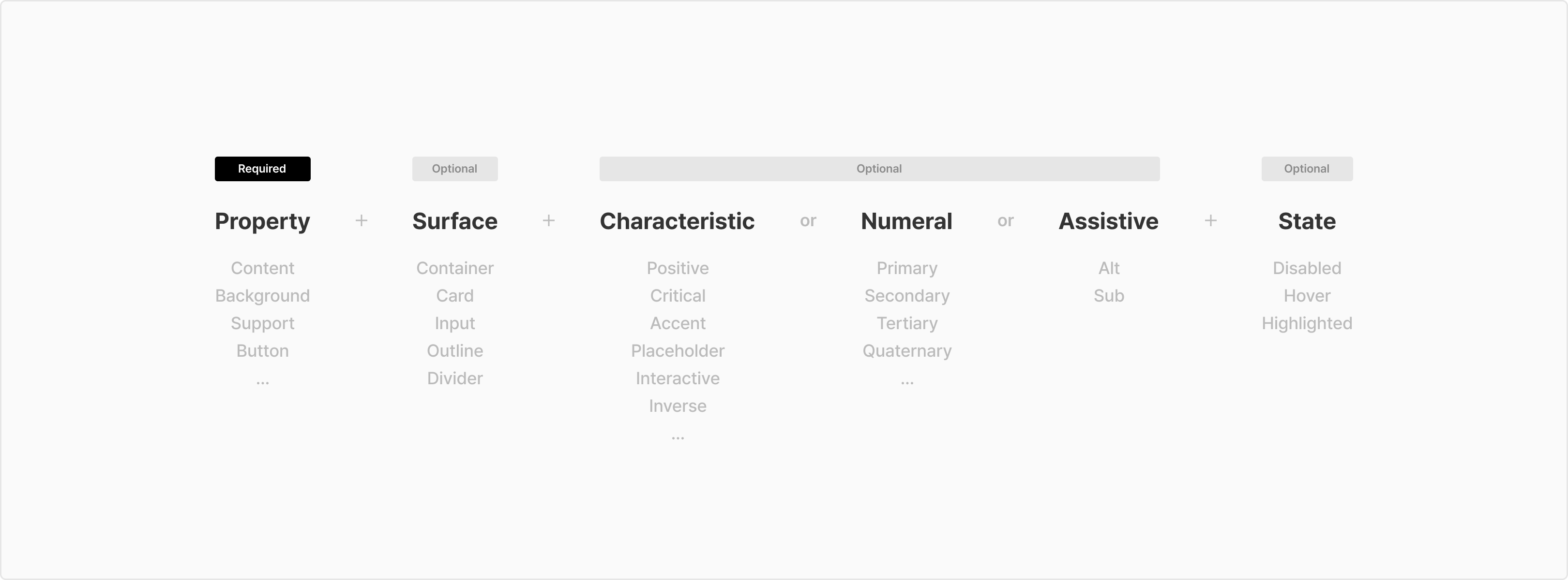
Name
Usage
Example
Content/Primary
(Default) 기본 텍스트, 아이콘 컬러

Neutral900
Content/Secondary
텍스트 & 아이콘 Sub 컬러 1
Neutral500
Content/Tertiary
텍스트 & 아이콘 Sub 컬러 2
Neutral300
Content/Placeholder
Placeholder 텍스트 & 아이콘
Neutral400
Content/Disabled
텍스트 & 아이콘 Disabled 색상
Neutral200
Content/InversePrimary
컬러 Background 사용 시, 기본 텍스트, 아이콘 컬러
Common100
Content/InverseSecondary
컬러 Background 사용 시, 텍스트 & 아이콘 Sub 컬러 1
NeutralLight72
Content/InverseDisabled
컬러 Background 사용 시, 텍스트 & 아이콘 disabled 색상
NeutralLight16
Content/Interactive
interactive 텍스트 & 아이콘
Cyan800
Content/Highlighted
Highlighted 텍스트 & 아이콘
Cyan800
Content/Critical
Critical 텍스트 & 아이콘
LivelyRed800
Content/Transparent
Transparent 컬러
NeutralLight0
Name
Usage
Example
Background/Primary
(🏁 Default) Page, Card, List, Searchbar(White) 등의 기본 컬러
Common100
Background/Secondary
Page, Card, List 등의 Sub 컬러
Navy10
Background/InversePrimary
Snackbar, Tooltip 배경색
Neutral900
Background/TableHeader
Table header 컬러
Navy10
Background/TableHover
Table hover 컬러
Neutral10
Background/Transparent
Transparent 컬러
NeutralLight0
Name
Usage
Example
Background/Input/Normal
Input, Dropdown, SearchBar(Gray) 등의 기본 컨테이너 컬러
Neutral50
Background/Input/Contrast
Input, Dropdown, SearchBar(White) 등의 기본 컨테이너 컬러
Common100
Background/Input/Hover
Input, Dropdown, SearchBar(Gray) 등의 컨테이너 hover 컬러
Neutral100
Background/Input/Error
Input, Dropdown 등의 에러 컨테이너 배경 컬러
LivelyRed50
Background/Input/ErrorHover
Input, Dropdown 등의 에러 컨테이너 hover 컬러
LivelyRed100
Background/Input/Disabled
Input, Dropdown 등의 에러 컨테이너 disabled 컬러
Neutral10
Name
Usage
Example
Background/Overlay/DarkPrimary
Overlay Dark 레벨 1
NeutralDark48
Background/Overlay/DarkSecondary
Overlay Dark 레벨 2
NeutralDark64
Background/Overlay/DarkTertiary
Overlay Dark 레벨 3
NeutralDark80
Background/Overlay/DarkInactive
Overlay Dark의 Inactive
NeutralDark16
Background/Overlay/LightPrimary
Overlay Light 레벨 1
NeutralLight48
Background/Overlay/LightSecondary
Overlay Light 레벨 2
NeutralLight72
Background/Overlay/LightTertiary
Overlay Light 레벨 3
NeutralLight88
Background/Overlay/LightInactive
Overlay Light의 Inactive
NeutralLight24
Name
Usage
Example
Background/Shade/DarkTopToDown
Dark gradient Top → Down
NeutralDark48
-> NeutralDark0
Background/Shade/DarkDownToTop
Dark gradient Down → Top
NeutralDark48
-> NeutralDark0
Background/Shade/DarkRightToLeft
Dark gradient Right → Left
NeutralDark48
-> NeutralDark0
Background/Shade/DarkLeftToRight
Dark gradient Left → Right
NeutralDark48
-> NeutralDark0
Background/Shade/GrayTopToDown
Gray gradient Top → Down
Neutral50
-> Neutral50A0
Background/Shade/GrayDownToTop
Gray gradient Down → Top
Neutral50
-> Neutral50A0
Background/Shade/GrayRightToLeft
Gray gradient Right → Left
Neutral50
-> Neutral50A0
Background/Shade/GrayLeftToRight
Gray gradient Left → Right
Neutral50
-> Neutral50A0
Background/Shade/LightGrayTopToDown
Lightgray gradient Top → Down
Neutral10
-> Neutral10A0
Background/Shade/LightGrayDownToTop
Lightgray gradient Down → Top
Neutral10
-> Neutral10A0
Background/Shade/LightGrayRightToLeft
Lightgray gradient Right → Left
NeutralDark48
-> NeutralDark0
Background/Shade/LightGrayLeftToRight
Lightgray gradient Left → Right
Neutral10
-> Neutral10A0
Background/Shade/LightTopToDown
Light gradient Top → Down
Common100
-> NeutralLight0
Background/Shade/LightDownToTop
Light gradient Down → Top
Common100
-> NeutralLight0
Background/Shade/LightDownToTop
Light gradient Down → Top
Common100
-> NeutralLight0
Background/Shade/LightRightToLeft
Light gradient Right → Left
Common100
-> NeutralLight0
Background/Shade/LightLeftToRight
Light gradient Left → Right
Common100
-> NeutralLight0
Background/Shade/BlueDiagonal
Blue gradient diagonal LeftTop → RightBottom
Cyan500
-> Cyan800
Name
Usage
Example
Border/Primary
(🏁 Default) Divider 기본 컬러
Neutral100
Border/Secondary
세로형 divider , 활성화 상태의 card outline, divider 강조 레벨2
Neutral200
Border/PrimaryActivated
Search bar 활성 상태의 outline 컬러
Cyan800
Border/SecondaryActivated
Input 등의 활성 상태의 outline 컬러
Neutral900
Border/Selected
Selected 상태의 card outline 컬러
Cyan200
Border/Table
Table outline 컬러
NeutralLight72
Border/Disabled
Table & Container outline disabled 컬러
NeutralLight88
Border/Critical
Table & Container outline critical 컬러
LivelyRed800
Border/InversePrimary
배경과 아이템을 시각적으로 분리하여 강조할 때 사용합니다.
Common100
Button/Disabled
Disabled 버튼
Neutral10
Name
Usage
Example
Button/Primary
Primary 버튼
Cyan800
Button/PrimaryHover
Primary 버튼 hover 컬러
Cyan900
Button/Highlight
Highlight 버튼
Common100
Button/HighlightOutline
Highlight 버튼 outline 컬러
Cyan800
Button/HighlightHover
Highlight 버튼 hover 컬러
Cyan100
Secondary 버튼
Secondary 버튼
Neutral50
Button/SecondaryHover
Secondary 버튼 hover 컬러
Neutral100
Button/Destructive
Destructive 버튼
LivelyRed800
Button/DestructiveHover
Destructive 버튼 hover 컬러
LivelyRed900
Button/Disabled
Disabled 버튼
Neutral10
Button/OutlineDisabled
BoxSubtleButton/White, Blue disabled outline 컬러
Chips outline type disabled outline 컬러
Neutral50
Button/Blue
BoxSubtleButton/Blue 버튼
Cyan50
Button/BlueOutline
BoxSubtleButton/Blue outline 컬러
Cyan200
Button/BlueHover
BoxSubtleButton/Blue hover 컬러
Cyan100
Button/Default
BoxSubtleButton/White 버튼
Chips outline 타입 배경 컬러
Common100
Button/DefaultOutline
BoxSubtleButton/White 버튼 outline 컬러
Chips outline 타입 Outlinet 컬러
Neutral100
Button/DefaultHover
BoxSubtleButton/White 버튼 hover 컬러
Chips outline 타입 hover 컬러
TextButton hover 컬러
Neutral50
Button/InverseDefaultHover
TextButton white hover 컬러
NeutralDark48
Button/FloatingDark
Blue gradient diagonal LeftTop → RightBottom
Neutral900
Button/FloatingLight
Floating 버튼 Light style
Common100
Button/Transparent
Transparent 컬러
NeutralLight0
Name
Usage
Example
Support/Positive
Positive information / 단순 정보 표기 및 강조 완료된 상태값
Cyan800
Support/PositiveAlt
Positive information / 단순 정보 표기 및 강조 완료된 상태값의 대안
Cyan100
Support/Warning
Warning information / 주의성 정보 표기
Yellow900
Support/WarningAlt
Warning information / 주의성 정보 표기의 대안
Yellow50
Support/Critical
Critical information / 주의 및 에러, 혜택 강조
LivelyRed800
Support/CriticalAlt
Critical information / 주의 및 에러, 혜택 강조의 대안
LivelyRed100
Support/Adaptive
Adaptive information / 유동적인 특별한 정보 강조
Orange600
Support/AdaptiveAlt
Adaptive information / 유동적인 특별한 정보 강조의 대안
Yellow50
Support/Neutral
Neutral information / 고정적, 반복적으로 노출되는 정보
표기가 필요하지만 강조 될 필요는 없을 경우
Navy500
Support/NeutralAlt
Neutral information / 고정적, 반복적으로 노출되는 정보
표기가 필요하지만 강조 될 필요는 없을 경우의 대안
Navy10
Support/Normal
Normal information / 단순 정보 표기
Neutral600
Support/NormalAlt
Normal information / 단순 정보 표기의 대안
Neutral50
Support/Benefit
Benefit information / 무료취소, N시간 대실 객실 보유 강조 색상
Green800
Support/BenefitAlt
Benefit information / 무료취소, N시간 대실 객실 보유 강조 색상의 대안
Green50
Support/Favorite
Support/Favorite
LivelyRed800
Support/FavoriteAlt
찜 아이콘 Default
Neutral500
Support/Rating
리뷰 별 아이콘의 Activated 색상, 평점 뱃지의 배경색
Yellow800
Support/RatingAlt
리뷰 별 아이콘의 Default 색상
Neutral200
Support/Holiday
캘린더 내 공휴일, 주말 텍스트 표기
LivelyRed900
Support/DisabledAlt
Tag 등의 DisabledAlt 색상
Neutral10
Name
Usage
Example
Support/Rewards/Elite
엘리트 Main color
Violet600
Support/Rewards/EliteAlt
Support/Rewards/EliteAlt
Violet50
Support/Rewards/Basic
등급명 ‘Elite Basic’의 Main color
Violet400
Support/Rewards/BasicAlt
등급명 ‘Elite Basic’의 Main color의 대안
Violet10
Support/Rewards/ElitePlus
등급명 ‘Elite Plus’의 Main color
Violet800
Support/ElitePlusAlt
등급명 ‘Elite Plus’의 Main color의 대안
Violet100
Support/Rewards/Tripholic
트립홀릭 Main color
LivelyRed800
Support/Rewards/TripholicAlt
트립홀릭 Main color의 대안
LivelyRed50
Name
Usage
Example
Support/Skeleton/Base
스켈레톤 Content base color
Navy10
Support/Skeleton/Shade
스켈레톤 Base 위에 올라가는 gradient
Neutral50A0
-> NeutralLight72
-> Neutral50A0
Name
Usage
Example
Support/Asset/Scrollbar
Scroll bar 색상
Neutral100